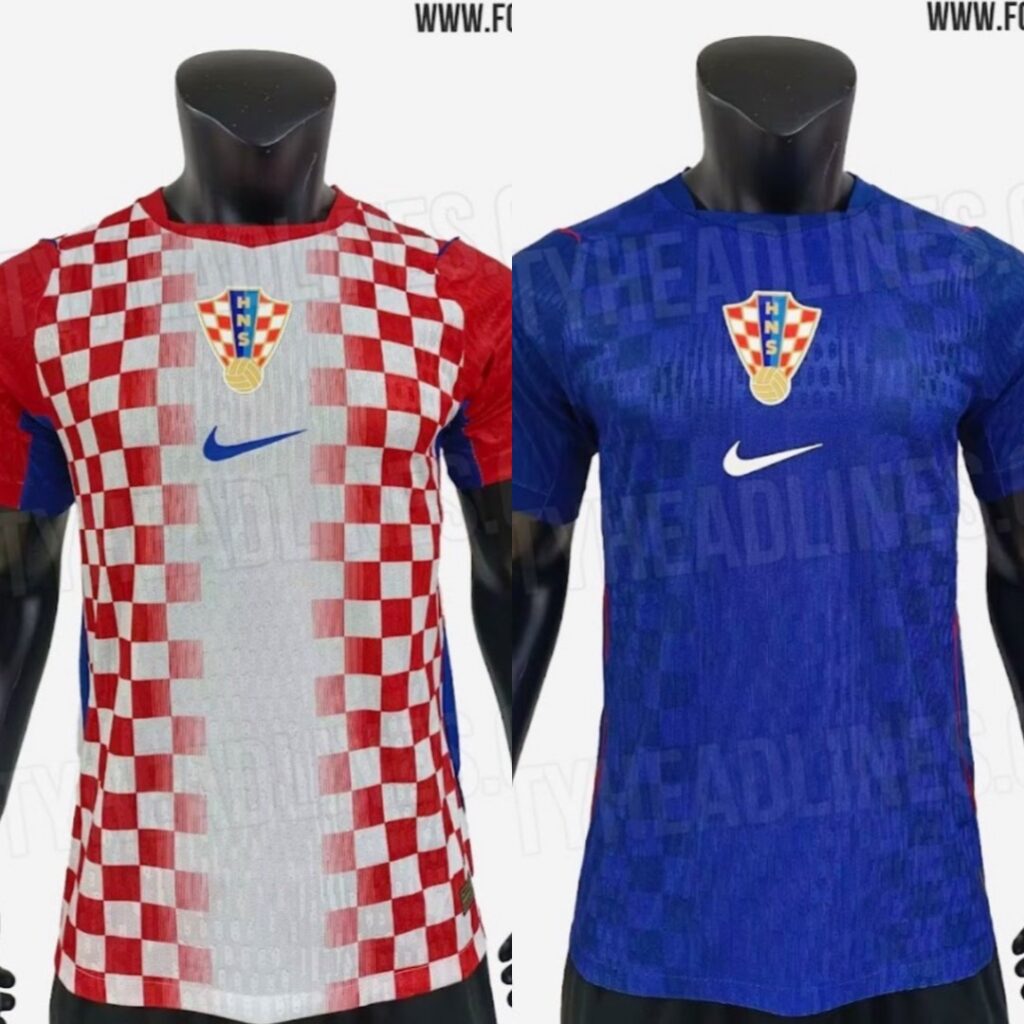
The leaked designs for Croatia’s 2026 World Cup kits are out after FootyHeadlines.com published early images, and honestly, they’re not the strongest showing. Ever since the standout 2018 set, it feels like Nike hasn’t quite found the right touch for the Vatreni, and these new versions don’t really change that.
The home kit is a tough one to figure out. The checkers are there, but the way they’re arranged gives the shirt a slightly unfinished feel. The away kit sticks to a blue base, but the design ends up looking more like a training top than something meant for a World Cup. And based on the leaks, this is what the home and away kits look like.
The timing makes all of this even more notable. These will be Nike’s final Croatia kits before the team switches to Adidas after the 2026 tournament. With that in mind, you’d hope for a memorable send-off, but these early designs don’t really deliver that spark.
There’s always a chance the final release ends up looking a bit different, but for now, it’s hard to get too excited about this last Nike chapter for the Vatreni.


Oh and by the way boys and gals.. Ante Kvartuc video made Vecernji-list.hr headlines regarding these world cup jerseys being horrific lol
It hurts the eyes looking at that home kit.
If they were going to go that route, open up the rib cage, I would have a heart on fire in the middle.
They did the same layout with the Slovenia jersey, with the Triglav mountains in the middle with a doljina through the rib cage with a big fire ball on the center peak.
I’m calling BS. Nearly all the leaks we’ve seen over the years have been BS and this is another one. Looks like a training shirt, not the actual jersey.
Kaka. They could have done a lot more with that gradient effect. Looks like a high school student designed it.
113 years later and Albanians still celebrating their Independence Day passionately
Hopefully Croatians are still doing the same 89 years from now
As reference, here are the Brazil Nike home kits every year since 1997
***.instagram.com/p/DDX_ZN6Oefj/
They have basically kept it the same w slight tweaks on trim, collar, logo placement/size, etc.
But the yellow was the same every year until they made it more pale last couple of years
There was no reason Nike could be not keep the checkers the same every version instead of this progressively worse/basterdization/race to the bottom
Anyone see Bati’s 30 minute n?
Brazil have been synonymous with football for over 60 years.
As good as we are at the game we are not Brazil.
Not sure why you’d expect Nike to respect our uniforms the way they would Brazils.
vey true D.
Too busy.
A checkered pattern is busy enough on its own, so you have to be careful when adding things to it.
The white streak, the oversized HNS logo, centered Nike logo, solid color sleeves, blue stripes under the sleeves…
Just way, way too much going on. It’s a mess.
As for the away kits… I don’t like that we’re now moving away from black after it was such a hit in 2018 and 2020.
Nike has badly botched our kits in 2022, 2024 and (now) 2026.
I can’t wait until Adidas takes over. Almost all of their WC2026 kits look good.
I actually like the home jersey. Looks different. Red sleeves are cool. Now the away jersey on the other hand….dogwater
I’m not a very critical person when it comes to aesthetics. That said, these are garbage.
Sure, Croatia may be small potatoes to Nike, but they want to make some money with consumer sales. I don’t know how they can think these will sell well.
Croatia is so insignificant to Nike. If you’re not US , Brazil , they probably had a janitor at their head office in Portland , Nike World do this design. Bring on Adidas. I say let’s do checkered socks and more plain kits up top. There used to be Toronto-Croatia kit with checkered socks, and it I recall opposing goalies complaining about being able to follow the ball because of the socks- no joke. Every tactic works if you can have checkered socks.
Doesn’t help that Croatian gear isnt available on a lot of sites like worldsoccershop or FIFA.
If we make another semi final run I couldnt care less what our kits look like.