

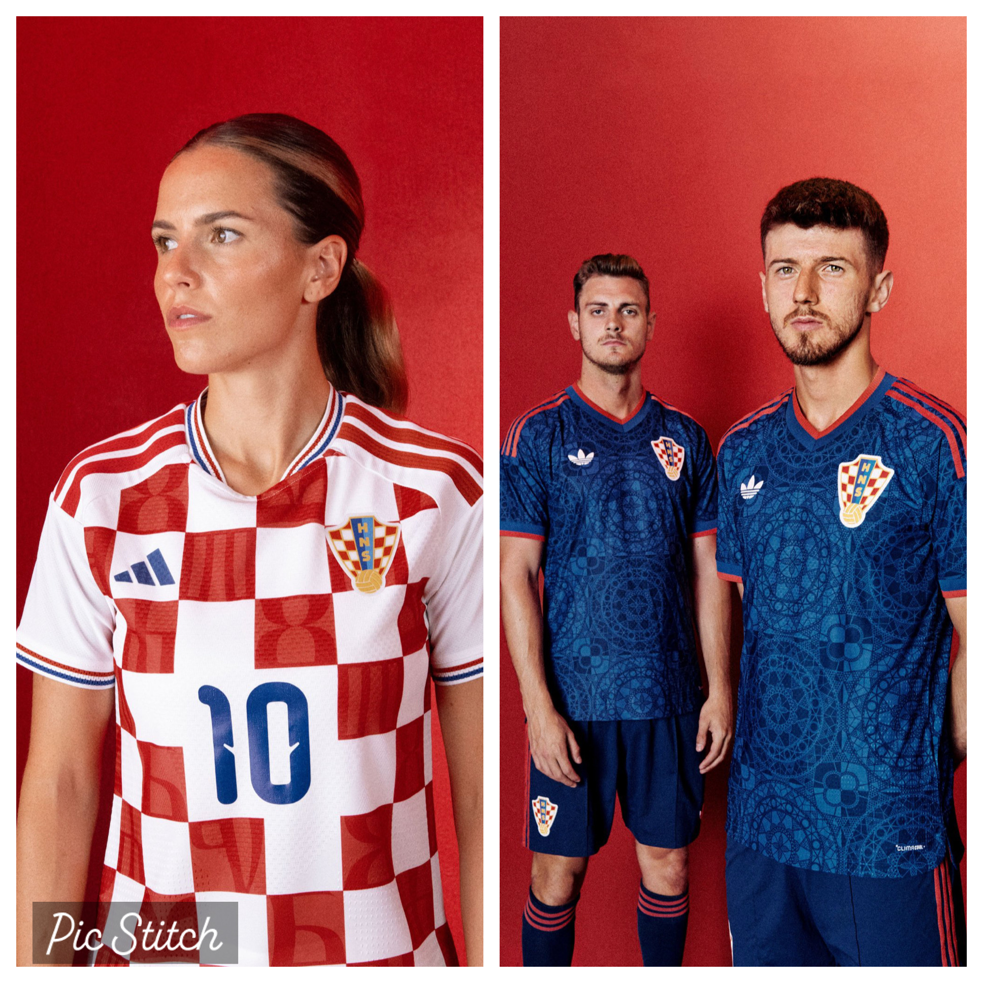
The Adidas era has officially begun with the Croatian national football team! After a quarter of a century with Nike — and many groans and moans from Croatian fans for change — the call has finally been answered.
Both home and away tops look different to anything the Vatreni have worn before and pay direct homage to our history and culture with the glagoljica script (oldest Slavic alphabet) on the home red checkers and the čipka lace design on the away blue.
Honestly, these are both bangers AND will only look better with full name and numbers across all three items of clothing (shirt, shorts, socks). What do you guys think? Link to HNS Shop

Its hard to notice, but the new away jerseys do have a large blue checker pattern on them. At first I thought the same (no checkers, and didn’t like them), but realized the subtle large light blue and dark blue checkers… its starting to grow on me after the Czechia game…
Underwhelming, I was expecting better.
Home kit: that white space in the middle of checkers shouldn’t have been and there’s way too much white on the back.
Away kit: looks more like a warmup jersey than anything else
Best kits for me are still 1998 for home kit and 2018 for away kit
I absolutely hated the 2026 jerseys until I saw them in person. And then they looked great. The blue with the red thread highlights, but especially seeing the NT play in the home jerseys at the game. So as much as I dislike these at first glance a little bit, the same will probably hold true when seeing them in person.
The 2026 kits only looked good because the 2024 kits were very bad.
The 2024 kits were the least Croatian-looking kits we’ve ever had. The giant blocks were one thing…but it is also the only home shirt we’ve ever had that did not have any blue on the front of it. The collars were white and the number was white. It was strictly red and white (making it look extra Polish or Maltese).
2026 was not a good looking kit, but it at least had some blue on it, and the checkers were smaller (and actually looked like checkers).
These home & away by Adidas are IMO only second best to the 98 Lotto’s.
The home kit has the perfect sized checkers. The away top is stunningly beautiful.
Bravo Adidas!
Home is fine. Away is awful. Once step closer to no checkers.
I think they are limited to not being able to add any white to the away jerseys hence the lack of any checkers on the away.
They’re alright. They always look better on the field.
Best thing about either top is the crveni bijeli plavi trim on the home kit.
HUGE improvement from the last three kits we’ve had to endure.
The “incomplete checkers” kit from 2022, the “giant block Malta kit” from 2024, and the “bleached down the middle” stripe kit from 2026.
The glagoljica and paška čipka are both very nice touches. I like that the red color on the away kits match that neon red from the away 2018 kits. I also love the red/white/blue piping along the sleeves of the home kit (paying homage to our Euro96 kits).
These are very nice kits.
They’re ok
Away has to much bocanje
Got carried away with sicanje
I had to look it up to check. But, the away jersey is not based on sicanje tattoos it is an ode to Croatia’s lace making history.
So I think a different inspiration. The sicanje tattoos are very different. To be honest, I would have preferred the idea of the sicanje tattoos on a jersey.
I think it just might have been a little more difficult to pull off.
I mean, how many different cultures have lace making in their history and past we aren’t the only ones.
They could have used the kolo sicanje tattoo I think it would have been better to be honest and it would bear more significance on a jersey.
Dude, I’m just happy that we finally have a kit where the checkers on the front of the home kit haven’t been messed around with.
It’s been almost four tournaments since we’ve had normal sized checkers that don’t suddenly disappear from large areas of the front of the kit.
svaka čast na poznavanju povijesti
This is mostly a response to Maminjo not Davor. According to Davor noone is a true blooded Croat accept him. Must be nice high up on that mountain.
That’s true I do like the home kit. I was just mentioning that the away kit would have had more significance if they used the idea of sicanje tattoos.
The glagoljica is a nice touch on the home kits. The checkers are a nice profile.
All in all they are a huge improvement. Just one small gripe. I do like both either way.
Sicanje is a very cool tradition, but these tattoos were largely done on little girls.
Might be a bit strange to have our men’s football team covered in tattoos meant to keep little girls from being raped or converted by muslims.
Paška čipka is still very cool and everyone had these in their homes.
Sicanje is a very cool tradition, but these tattoos were largely done on little girls.
Might be a bit strange to have our men’s football team covered in tattoos meant to keep little girls from being r@ped or converted by muslimani.
Paška čipka is still very cool and everyone had these in their homes.
Sigh.
Please remove my comment from moderation.
in my mountain i know our history.
sicanje was more common in BiH than in hrvatska. since this is croatian national team and not national BiH team there is no need for sicanje.
imagine the trouble hns would get into if they used parts of BiH history for the shirts.
Why would Bosiaks (of all people) put sicanje on their kits?
This is a “Catholic Croatian” tradition practiced among the Catholics in BiH which (for your knowledge) are Croats.
This was also practiced in the hinterland of Dalmacija, because these were the regions most affected by the Ottoman invaders.
Of course you know this, but you are likely one of those Croatian leftists who hates Croat patriots and you do what you can in partitioning Bosnian Croats from Croats in Croatia proper.
@Mate1
Sicanje is a cool, but these tattoos were largely done on little girls.
Might be a bit strange to have our men’s football team covered in tattoos meant to keep little girls from being kidnapped by muzzie Turks.
Paška čipka is still very cool and everyone had these in their homes.
💯⬆️
They’re okay. Nothing to write home about. Tbh our away kits havent been great since ’06 and ’12, although black was obv a good choice in ’18. Anyway at least they aren’t bad, i think.
These are the best away kits since 2018.
1998 Lotto was the best. This is second best. I think Adidas did a great. Nike has zero creativity and it’s a company on a major decline and it’s going to get worse for them.
Glad to see some checkers blended into the away kit. I’m happy with them.