

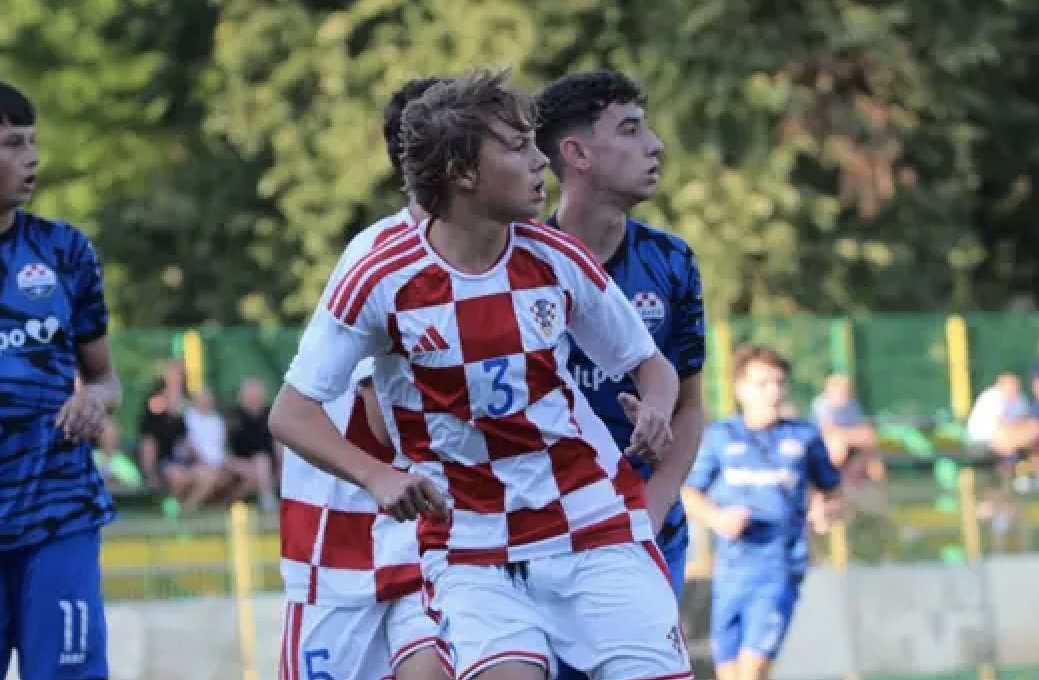
The Croatia U16s sported the new Adidas home kits this week. It is officially the end of a 25-year Nike deal that will see our beloved Vatreni shift kit makers, which to many, has been wanted for years.
Consensus: they look great! However, per the 24Sata picture, we can’t quite make out the entire picture and what the socks look like on the home kit. Would they look better with white or blue? Probably white.
Your thoughts?

I’d honestly think it could be very bold and cool if the socks were red haha.
So glad that they filled the weird checkers gaps in the middle of the shirt in the end
Adidas fanboys will love these, but they’re just OK.
Andy Bara getting Liva to Barca
What a f-ng God
Loan to DZ for the year
Then take over as back-up for Szczeny when he re-retires in 12 months
Well he got people thinking Cardoso Varela was worth something (he isn’t).
He also has people believing that Belinho is some sort of talent despite never playing a single minute of first team football for any prva HNL team.
If the man can do these things, then It’s very light work to convince people of Livaković’s talents.
Hopefully Dinamo will pull it out
Yeah I prefer the kits originally leaked
Maybe teh seniors will be a bit different?
I don’t think blue stripes would look bad?
Musa lighting up mls
You guys think he comes back to Europe ?
He definitely needs to move back to Europe.
He’s 28 and I don’t think he’d be taking a pay cut by going back. He makes about $2.8 million USD. He could probably get a similar salary somewhere in Europe.
Promise David to Brighton
Good news for Luka as another big strong presence in the box for corners
Also great for Biondic and his game time at Royale SG
Fillip Pavic 6 minutes today
Jaga Thursday 14:30 ET
Dinamo missed a great opportunity to seal a spot in the Champions League.
Great start and leading 2 – 0 after 10 minutes they had Viking on the ropes and had chances to extend the lead, but Zajc hit the post and Stojkovic shot over the top from an acute angle when it would have been better to cut the ball back for Beljo.
Misic and Valincic with bad defensive clearances gifted the opposition for their two goals.
Return leg next Wednesday will be tough on artificial grass. Dinamo are definitely better technically; however, Viking side is physically fitter and stronger having already played 17 matches in the Norwegian League.
Nice to see Mudra get some minutes
Hopefully Zajc and Stojko injuries nothing serious
Got to do the checkered socks to finish it nicely.
A step in the right direction for sure, but the piping around the collar in the leaked photos was nicer.
Misic giveaway customary 1 time each game, gift to opposition.
Valincic bonehead in defense
Vinlof not good enough. Goda better
Stojkovic quiet but still effective
Lisica good.
Beljo doing ok
Zajc working hard
Some nerves across the team and they don’t look fully fit
Crazy to have 3 bone head youngsters in a back 4. McKenna doing his best to hold it together
Oršić dangerous but also looks a bit slow in the legs. Fitness preparation not got it right for this game. Second half they will improve as the muscles get up to speed. Last 20 minutes will drop off sharply. Subs needed at 70 minutes. Hopefully dinamo have scored 1 or 2 before that
Bad giveaway from Misic and I agree Valincic wasn’t great but Vinlof? he was pretty darn good today.
Dinamo, by far, deserved to win this game…the created and the only reason Viking scored was from Dinamo gifting them.
the team doesn’t look like their in a good form but they’re not in bad form either.
Stojkovic, Misic and Orsic all looked average or below average today so I hope things can only get better
Could’ve done without the Adidas stripes on the sleeves tbh.
Stripes and checkers clash like anonymous doing more than 5 push ups!
Why do the checkers stop under the arm-pits and just white vertical block – can’t adidas afford to cover the whole kit with checkers
The best eye tests the World has ever seen
10/10 IQ run by Zuzic
#####
🚨 𝐍𝐄𝐖: The HNS Refereeing Commission has reviewed five situations from the third round of the SuperSport HNL and found no mistakes.
✅ Supported decisions:
• Istra 1961 – Slaven Belupo: Direct free-kick and red card for Filip Kutleša after stopping Nik Škafar Žužić from an obvious goal-scoring opportunity.
[HNS]
this is not what the senior team will wear.
Interesting.
These are not the kits that were leaked.
The leaked ones had six smaller checkers that went horizontally. This one has only five (and the number can actually fit in one square instead of having a white block area in the middle of the kit as shown in the leaked photo).
I don’t like the sudden white sleeves though. The leaked ones had the nice red/white/blue piping on the edge of the sleeves (similar to our Euro96 kits).
Strangely, the shorts in the photo shown above actually have this red/white/blue trim, so I’m not sure why they don’t have it on the sleeves too.
However, when you look closely at the sleeves, it looks like a white fabric has been stitched over the sleeves to cover them up.
They may be doing this to cover up some badges (probably a Nations League or Euro2028 badge). It could be a case where they are just wearing the senior team’s kits for these upcoming Nations League games in September, but they covered the sleeves because this isn’t a Nations League game.
Overall, they are much better than our previous three Nike kits (our last good kits were in Euro2020) and I like the fact that they reduced the amount of checkers to five (instead of six) since our ACTUAL grb is five (plus you can now fit a number in one of them).
I hope I am right that they just temporarily covered the sleeves, and the Euro96 trim is on the sleeves as well.
I think you might be correct the white sleeves look like an add on. Adidas would never desighn a finished product with this sleeve. When I zoom in on the left shoulder of player # 3 in the image I see what might be the real sleeve slightly showing the same trim as on the shorts and the Adidas stripes seems to travel under the add on sleeve.
Absolute fire for the Vatreni.
Brings back the original Lotto vibes of the 90’s.
Where the sponsor and the checkers are interacting.
Nike was mid for decades.
The Adidas gear is going to be dope to rock on the regular.
I am due for some new Vatreni gear this fall.
Can’t wait !
I also love Adidas but not when it interferes with traditional sweaters.
The small logo on the chest should be the only symbol on the kit. the stripes on the shoulders are terrible looking.
It takes away from our checkers which should continue throughout the shoulder area.
In my opinion, it’s a dud ;(
Faster than Anonymous picking his nose.
Stronger then Joe Magarac,
Able to eat 2 tons of cevapi in a single bound,
Look it’s Klepetan,
It’s Rimic Automobili,
No, it’s SUPER SLAV.
Not bad. The stripes should run down the full length of the sleeves though and some pleter would be a nice touch.