
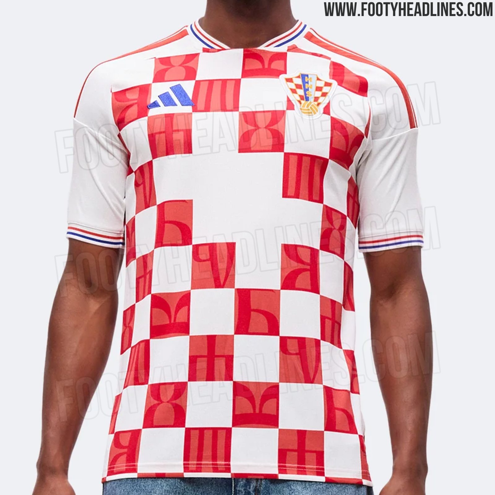
BREAKING! Croatia’s 2026/2027 Adidas home kits have leaked online by FootyHeadlines.com and look to consist of traditional red + white checkers with Glagolitic script (Glagoljica). The HNS and Nike end their 26-year partnership on July 31st, 2026 when Adidas will step in for the first time since Nike took over in 2000 following Croatia’s short (but successful) stint with Lotto in the late 90s.
What do you think???
If it’s a “2026/2027” jersey, doesn’t that mean that the Nike deal will be effective in September and if you bought the “new” one they’ll be using in the WC, you won’t get the usual two years, but a whopping 3 months out of it?
Agree this definitely looks better than Nike’s last edition.
Also agree that if the away kit leak is legit, it’s terrible. It’s similar to Nike’s away kit/warm up shirt but worse.
It’s OK. Better than the last two from Nike, but not as good as 2018 or 2022.
2022 home kits weren’t great. Missing checkers and stuff?
This is better than that.
2018s are still the best (home and away) and 2020 homes were essentially the same as 2018.
These adidas kits are very nice, especially with the leaked shorts and socks too.
2022 was a good try at something different. I didn’t like them at first (similarly, when I saw them without numbers), but they grew on me.
A would rank these Adidas homes below 1992, 1998, 2008/2010, 2014, 2018, 2022
EDIT: I agree they do look nicer with the shorts and better from afar (script looking more subtle).
I have never rated the majority of Croatia’s Nike kits. The only home shirt that I liked was the first one they released back in 2000, which was the one that had black patches under the armpits and also a round collar.
However, this Adidas one looks a beauty. Love the Glagolitic lettering!
Good job Adidas if that is a legit leak. The break in the checkers is to have the shirt number more clear I would think. Only problem with Adidas is you’re sharing your club or country’s look with the 3 stripes, by they’re the 3 stripes so who cares? I’m interested in seeing Adidas change up the away kit instead of just swapping colors like NIKE did for this WC.
I just noticed the Adidas away kit has also been leaked and it may be the worst away kit yet. No checkers at all and a shit shade of blue. Really hope that gets revised.
Just realized what I was describing is actually the pre-match away jersey, so no one will care anyway.
I like these actually. The gap upper stomach doesn’t bother me much.
Where would I score a long sleeve retro like Ante had on in his latest post? Can’t seem to locate online
If only there wasn’t this weird checkers gap in the middle they’d be so good. Everytime they do something asymmetrical with the checkers it spoils the whole concept. The glago letters also didnt have to be so big, it overshadows the checkers’ class too much
I still like them but I definitely agree with some that they tried too hard. Hopefully they’ll correct those details by the time they come out
The glagolica letters aren’t going to be as visible as they are in this photo. They’re a nice touch, but you’ll only really see them when you have the kit (in person) up close. You won’t see that on any TV broadcast.
This issue looks pretty creative, and thoughtful, not consistent with Adidas bland standards, but am worried going forward.
The adidas kits that Italian’s lost to BiH were so hideously simple, generic, conventional; ….a trademarked adidas design with no creativity, they could be found in any AYSO small town issue, and in the end the Italian uncreative loss was appropriate to their uniforms.
I would have been fine staying with Nike or going back to Lotto. I don’t like the idea that Adidas needs to self-advertise with the in-your-face stripes to distinguish themselves as the manufacturer, where small Nike Swoosh logo is more sublime and organic, and is not so “In your Face” advertising.
The Away Nike uniforms in 2018, will always be a classic in my mind.
I approve of this design. But I hear you with the concern about their signature advertising influencing future kits.
The 2018 away kit was a masterstroke. I also was a huge fan of the 2022 away version. I hope we don’t go too plain with the brighter blue for the aways. Darker the better.
These kits are actually nice.
Wish they went with five checkers across each row instead of this awkward number of six checkers though?
But can’t complain. These are better than the ones we’ll be wearing at the World Cup, and definitely better than the past two Nike kits before this one.
I can’t see anything new topping the 2018 kits, both home and away. The GOAT for vatreni jerseys.