
The 2022 World Cup is now four months away and we haven’t heard a peep out of Nike or the HNS on how the new Croatian kits will look. I thought the Vatreni might roll them out in June during their four UEFA Nations League matches, but that wasn’t the case. It will be a forgone conclusion that we see the new kits in September when Croatia takes on Denmark and Austria in the last two matches of Nations League on 9/22 and 9/25. This is the last international break before the World Cup begins.
If the above pictured kits are true, both look extremely identical to 2018’s kits. Can you blame them for going back?
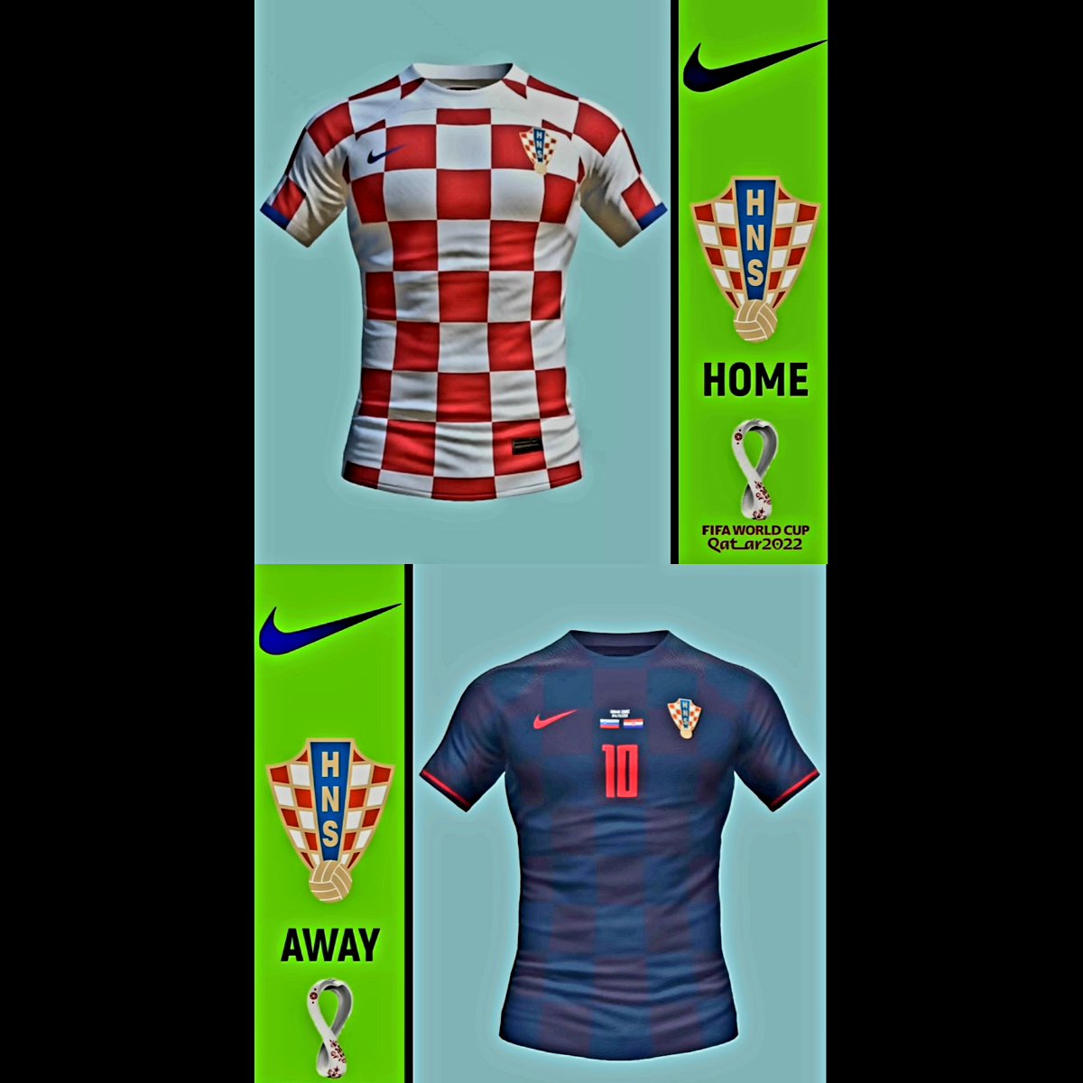
The home kit for Croatia is always more of the same from Nike. It’s pretty hard to mess up the standard red-and-white checker design. I like the fact that this version is straight checkers without any weird designs or zig zags. That never did anything for me.
For the away kit, these would be very much like 2018’s version with checkers made from black and navy blue squares. I like the red outline on the sleeves and would definitely sport this kit. The 2020 version with the small black and grey checkers were okay, but not better than the inaugural black shirt in 2018.
If these are the kits, do you approve of them? I do.
At the same time, I can’t wait for the Nike contract to be over because they haven’t wowed Croatia fans in nearly two decades. Lotto 98. Still Croatia’s best kit all-time.
Ive seen the same home kit leaked on a few different sites, but nothing on the away jersey anywhere. I could be wrong, but I thought I once read somewhere, that Nike and the HNS have an agreement that the home kit has to have at least 50% or 60% coverage of red and white checker pattern on them. Most likely gonna see the away jerseys for our first two, if not all three group matches this upcoming world cup.
I dont like the away, it looks too much like previous Holland jerseys
I can see the Van Persie flying header against Spain as I read your comment.
Yep that’s the one i was thinking of haha
Apparently Leipzig rejected 80 mill for Gvardiol!
They’re definitely not cash strapped lol
Isn’t the Red Bull owner (Dietrich Mateschitz) a Burgenland Croat?
Maybe he’s a big Gvardiol fan and doesn’t wanna sell 🙂
I like these designs, but would prefer the away kit to be the same colours as 2018 (black/blue). I’m not sure about this blue/red combo…maybe I’ll change my mind when I see it in person.
For the home ones, I definitely prefer when the sleeves are without checkers.
Here is the back of the new kit:
https://twitter.com/matejdugi/status/1554215429090033665
Since the back is blocked out in white (due to the name and number) it looks alright with the sleeves being checkered.
I just hope they don’t put a big white square block behind the number on the front of the kit. Ruins the checkered pattern there.
Will be difficult if not impossible to better the 2018 jerseys. To make larger checks and to add blue and black as an away jersey was an inspired decision. Pity the fool tasked with eventually changing this design.
Lotto96 were better than Lotto98.
I didn’t like that ’98 half jersey in checkers. People only like them now because of the third place nostalgia attached to them. But our home kits should always be a full checkered kit, with minimal blank white space.
The Russia 2018 home and away kits with the large squares were probably our best ever kits. They will be immortalized in history with our second place finish.
These rumored away ones for Qatar have potential to be our best away ones too. They’re a great design, and it looks like the checkers will not interfere with the number on the back (so we can have a full checkered back too).
We just need to do something remarkable in them, to stamp them in history.
Nah the wind-blown flag design of ’98 looked awesome, regardless of how the performances were.
According to Nike, the two colors for the away kits are ‘Darkened Blue’ and ‘University Red’.
This rumored photo looks like it is legit.
I like these away kits alot. They look as good as our Russia 2018 away kits but with red checkers, which is nice because we rarely get to see red checkers due to the color red being used by so many teams. Now we have them on our away kits.
Black and red or blue and red checkers for the aways?
I think black or blue and red would be so cool and mostly likely instantly a classic
I wouldn’t mind seeing a more white with a bit more minimal checker design for one tourney
(There was some good designs floating around)
But hey you just can’t argue when you see checkers who or what that represents anymore
Truly iconic now
Now let’s go boys. We keep playing like the last little bit
And we can do some damage again
Yes I like them, especially the away strip.