
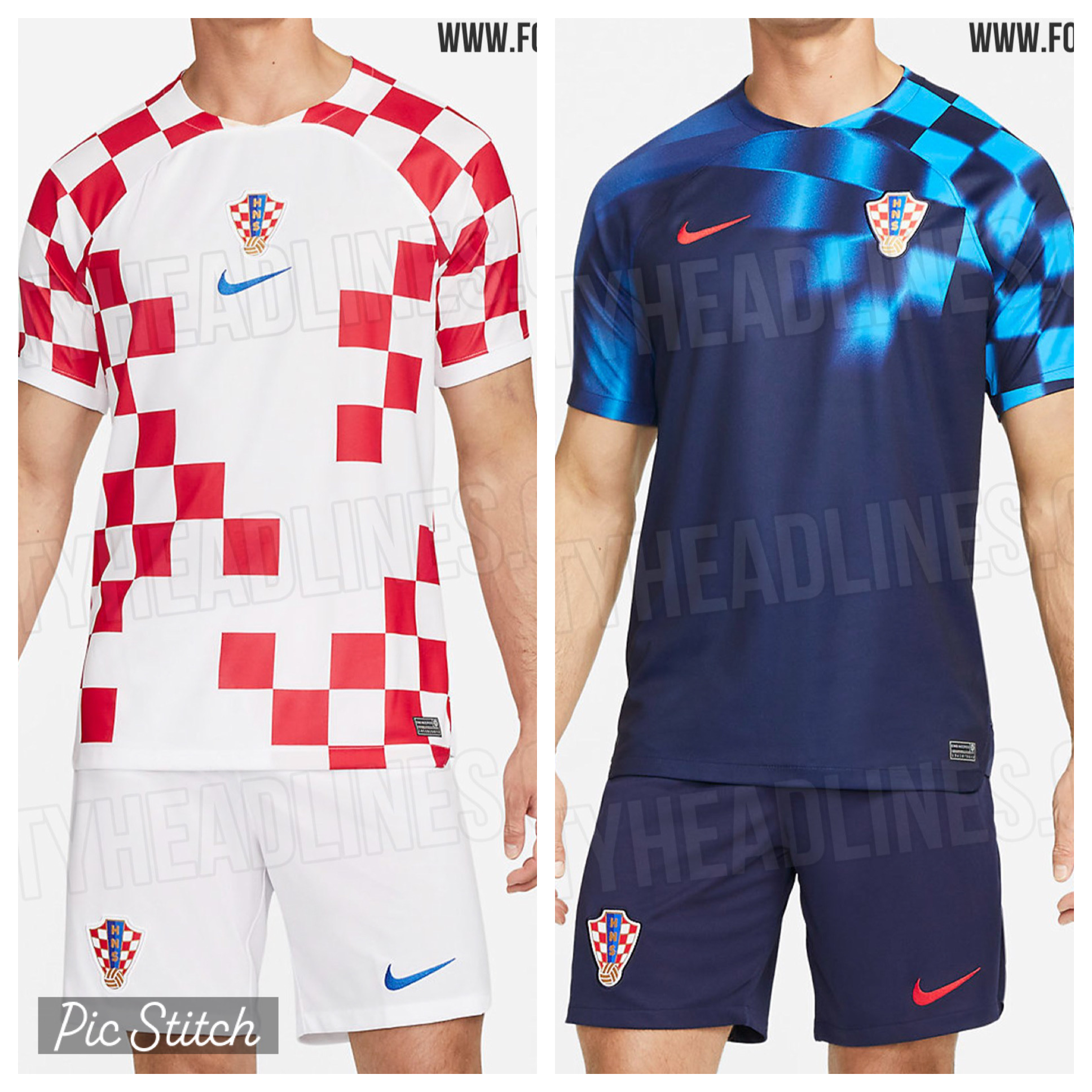
We are now two months away from the 2022 World Cup kicking off in Qatar with no sign of how our beloved Vatreni will suit up. There have been plenty of leaked photos the past few months but it looks like the above picture is the correct one; and I couldn’t be more disappointed! If these are in fact the Croatian kits for Qatar, I couldn’t give the designers at Nike a bigger eye roll. I think we can all agree that more or less, we’re happy every other summer with our staple red-and-white checker design. It’s been Croatia’s signature for the home kit since 1996. Everyone in the world knows what it is from 100 yards away and if it ain’t broke, don’t fix it. Yet, Nike managed to break a design that didn’t need tinkering. Why are there missing checkers? Why?
And the proposed away kit looks like a pre-game training top at best. I absolutely loved the 2018 all-black away kit with navy blue checkers and would have liked to see another iteration of that. Instead, we’re going to get some bright sky blue checkers over one shoulder. Meh.
The new kits will officially be unveiled in 10 days when the Vatreni wrap up their UEFA Nations League group stage campaign versus Austria and Denmark. I hope these aren’t the kits but all signs in the Twitterverse point to YES.
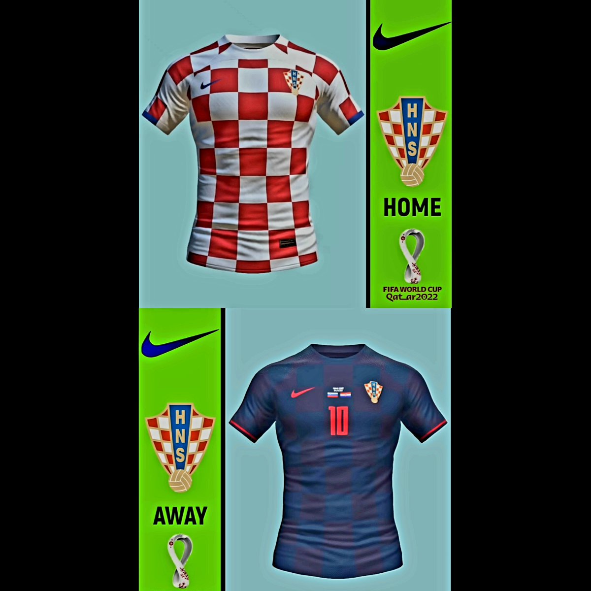
I would have much rather seen something like the above proposed leaked kits. The home kit is fully checkered. Strong. With a little bit of blue outline on the sleeves. That’ll do.
The away kit looks to be two different shades of dark blue across the entire shirt. I would have been really happy with something like this and would have bought it right away. Instead, it looks like we’re getting a bird taking a checkered shit on your left shoulder.
Savez needs a kit contract with Adidas , dosta ovi Nike , need something different.
Looks like they’re real, what a shame.
https://hnswebshop.hr/
One word: atrocious
There is no harmony in the design between the shoulder and chest squares.
Home kits are trash. I’m 99% sure those are the final NIKE designs. Lazy checker design that inspire nothing. Look at it twice and it still makes no sense. Away shirts I don’t mind. Color looks like the sun filtering through the Jadransko. Will probably purchase the away.
Who cares about what the kits look like. As long as we win.
It won’t make no difference if we have the nicest kits and then shit the bed.
The away kit is 🔥
Bayern yet another beat down for farca.
16-2 last four matches.
Real Modrić 4 Life.
Funny how everything was the fault of Rakitic.
Boli me kurac
Munich
And Leverkusen with 2-0 wins over Spanish giants
I feel Germany always getting a bad rap as a farmers league
Seriously though….a few years ago, Macedonia fans hated their new kit, and got them to stick with the old one (I’m pretty sure it was for the euros). I would rather stay with our current kits, or revert back to 2018.
Can we just “pay” Nike to just keep the 2018 kits as is moving forward. Laughing
but wish we could!
We should protect our OWN Branding and not have someone like Nike perhaps not maliciously hurt it. The Shirt does move people and have a deeper relationship with Croatia itself and not just the Soccer Team. Bigger picture in a sense. The Shirt is our lobbying group for how amazing the Country and Culture are…
https://www.google.com/search?sxsrf=ALiCzsbnK3ZU6y-r119Offk8JR9IDUk06w:1663101726979&source=univ&tbm=isch&q=Croatia+away+kits&client=ms-android-samsung-ss&fir=aBA71YQKU-6FIM%252Cw8h70s5kIvRViM%252C_%253BGueLSpiRxNfM6M%252Ch7Mit9DMXqYqbM%252C_%253B8Ya4bmh3nRC9jM%252CJKulsnbNcwOF1M%252C_%253BTGCYEiDkuzVOoM%252CJKulsnbNcwOF1M%252C_%253BADGXlhnIAlCNPM%252C9QJhZXfQ2sk4fM%252C_%253BMA0msxZitdC0DM%252C6aJ2zHtOIRHEMM%252C_%253BXAT_N-T7uhf83M%252CCfAJAuRH9qETFM%252C_%253BToZE2kftP4tzOM%252CT5LYHSQrWOfqQM%252C_%253BrtUaed9VEMd6PM%252CN-zeRwn8x1smDM%252C_%253BhUmCFW6gHLR0SM%252CJKulsnbNcwOF1M%252C_%253BzxbPOOYpFXvyfM%252C6aJ2zHtOIRHEMM%252C_%253Bcn4XlU97Hes2eM%252CqmpK0SnrsNh4iM%252C_%253B07UuHeIScOduXM%252CjOF0rqJlr9b0_M%252C_%253BwAQps2PLZe3ukM%252C1Y4mW9mbssuZhM%252C_%253BB3qTqJQHVNZVAM%252CJKulsnbNcwOF1M%252C_%253BkSlQ-jy6mBxkdM%252C6viFCGVHAvMJRM%252C_%253BiDu75GBCNVVnyM%252C8XDR3l7rZ6oY7M%252C_%253BJonHd5plPEhG0M%252CxLw_otoLtE-UWM%252C_%253BA_6fm9En6DikeM%252CXKIr3D1vZ3csZM%252C_%253BrovqrpfVYuOwEM%252CPWR_iGIEAIshYM%252C_%253B-riSsifi1nCYmM%252CPWR_iGIEAIshYM%252C_%253BeSqcR5tZ-NeH4M%252CzzkZWqTvaeEabM%252C_%253BqkHsAu00uUYTMM%252CzzkZWqTvaeEabM%252C_&usg=AI4_-kQorhwwp1N2TDmbIDOcLYkkBfsHhA&sa=X&ved=2ahUKEwi6uqXd0JL6AhULAzQIHU_aCYkQ7Al6BAgFEDQ&biw=384&bih=744&dpr=2.81#imgrc=-tOtVE2VTABXEM&lnspr=W10=
The away kits are a play on the 2012 away kits.
https://www.footballkitarchive.com/croatia-2012-away-kit/
Sorry, bad link.
Kind of intrigued by the Libero away kit 2022-2023. I like it
Here is a new lineup: ivusic; juranovic, sutalo, gvardiol, Sosa; majer, modric, brozovic, perisic; petkovic, orsic.
442. Orsic is quick and he is the best finisher we have, along with kramaric. Petkovic is a good target. He can win headers and hold the ball up. And is skillful. He has a good understanding with orsic. They will score
Grbic starting again!!
The away kit should be blue with checkers since 2014 our away kits have been differnt my least favorite was euro 2020 didnt like rhe away kit.
2016 was nice and im in minority i like rhis one over 2018 away kit. But ko jebe kits lets play nice and get out of group.
This home kit looks dumb to me i rather it have been like the away kit with checker swirler homage to 98 kit
I’m still hoping these are fake. Is it possible that Nike or the Savez leaked these ugly fake ones, so that everyone will be so happy when the real kits are released? 🙂 I guess we’ll find out next week.
The away 2018 is far and away my favorite.
Simple yet bold with nothing too outlandish.. it’s the only one I have and wear it proudly to the gym,or even when the Mrs has me take out the garbage!
Yep. Absolutely no need for that design. The leaked kits below would be perfect. But still. Once the players put them on and take the field you wont notice. You’ll just see the vatreni. It will be fine
These are worse than 2002 Croatian jerseys. Abominations.
we can’t have non-Croatian Nike people doing our uniforms -they have no clue of the history and what our great history of victory mean in terms of a uniform that represents us. Start over . You can’t have checks that don’t connect- it’s a mess.
The Home kit stinks. I guess I’m in the minority here, but I actually kinda like the away kits.
Yea, I like having ‘dark’ away kits ever since we rolled out those 2018 black/navy checkered kits.
But these away kits don’t have enough checkers.
They would be good if the majority of the kit had those neon blue checkers.
Having them on one shoulder is not enough…and the other shoulder kind of looks like a striped pattern.
If they insist on having a fadeaway pattern, then they should have at least done both shoulders in the same checkered pattern so you could see them clearly on the field.
Those shirts are a disgrace, and I would hang or stab the person that came up with that shit given the opportunity.
The home is an absolute disaster. The hole in the checkerboard is distracting and looks to be different just for the sake of being different.
The away, were the checks the same colour as the 2018 away jersey, would be much better and a good nod to the 1998 jersey. As it is, in the immortal words of Kvartuc, yuck. But again, any change will be a downgrade from 2018.
It’s as bad as these nations league call ups lol
The kits in the second photo are amazing. Too bad they’re fake.
While the home jersey is aesthetically awkward, it is also pretty unique- I’m not sure it I like it or hate it. It’s akin to the QR code mock-up from a few years back (at least it was different!). With the away jersey, I can say I absolutely hate it. Nothing “Hrvatska” about it…the colour palette, the design, I don’t know….